So here is the train of thought: using my old cameras with B&W film; being impressed with B&W images and wanting to explore them; what happens if I put color back into them; how do we relate to color in photography? Other people go around thinking about important stuff like war and famine and presidential elections. I always seem to be muddling around with art and pictures. I often wonder if there is any hope for me.!


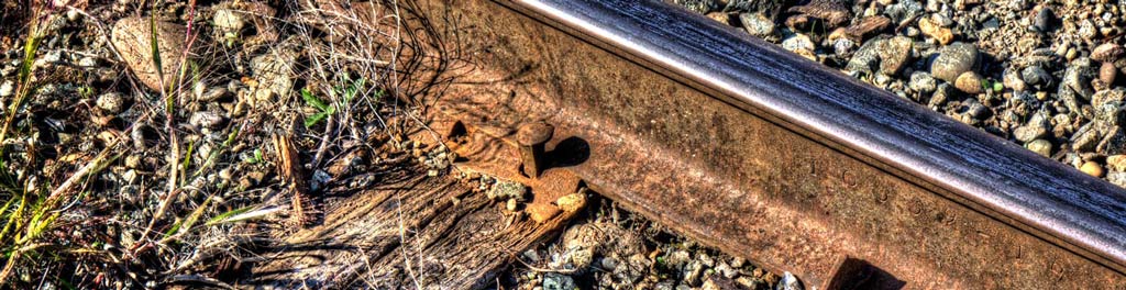
Wondering about this, I went back down to the railway tracks and tried to duplicate an earlier black and white picture. On the left is an image taken on Ilford HP4 with a Pellix camera and on the right is an image from a 60D. What do you think?
Don’t judge them in the small images. Look at them in the viewer (click on them). I like them both but they are certainly different images even though they are the same subject matter. And I would certainly display them differently. But that said, it is like children: so different and yet equally loved!
Ok, that is two different photographs. What if we simply take a color photo and subtract the color information from it? Both are the same image but one has no color. What do you think now?


Hmmm. Well, the first thing I noticed is that I treated them differently in processing. In particular the B&W image got much more contrast and sharpening applied to it. The color image did not seem to like that treatment. I have pushed the color a little too much I think but I am thinking also that how much color you apply will depend to some extent on where the image is to be displayed.
But that aside, what about the color. Is it necessary? Does it add to the quality of an image? I think it does in some cases. In the top two images the color is very pleasing. But in the bottom two images, I feel that the form of the tracks sweeping off into the distance contrasted by the cross ties is more important than the color. That picture is better in Black and White.
So, some images are better in B&W. And I suspect that those are the images that find their strength in their structure. Images that are less structured and depend on content will benefit from color. (How is that for a sweeping meaningless generalization? For me, I know what I mean!)
I think too it is important to consider where a picture is to be displayed. Let’s try and demonstrate that.

A room with very subdued color palet and one that relies on shape and form to give impact accepts a B&W photograph very well. One might even consider taking a tone from the room decor and shifting the color balance in the picture to better match the room colors.

On the other hand, a room with less form and depending more on color and light for ambience does better with a rich color photograph. Note that the image has the same color tones as the room which makes it a good fit in the decor.
I suppose I could get into an argument about the validity of a photographer adjusting his color balance to suit a color scheme in a room but I don’t see a problem. The interior decorator will chose art to match the room, or, in the case of expensive works of art, adjust the color scheme and decoration of a room to match the art. Our goal is to create pleasure. And even great artists must take into account by whom and where their work will be seen.
Is anything here relevant to what you are doing? Does this advance the conversation about art in photography? Or should I go back to watching presidential debates. I guess I am asking if politics trumps art ???