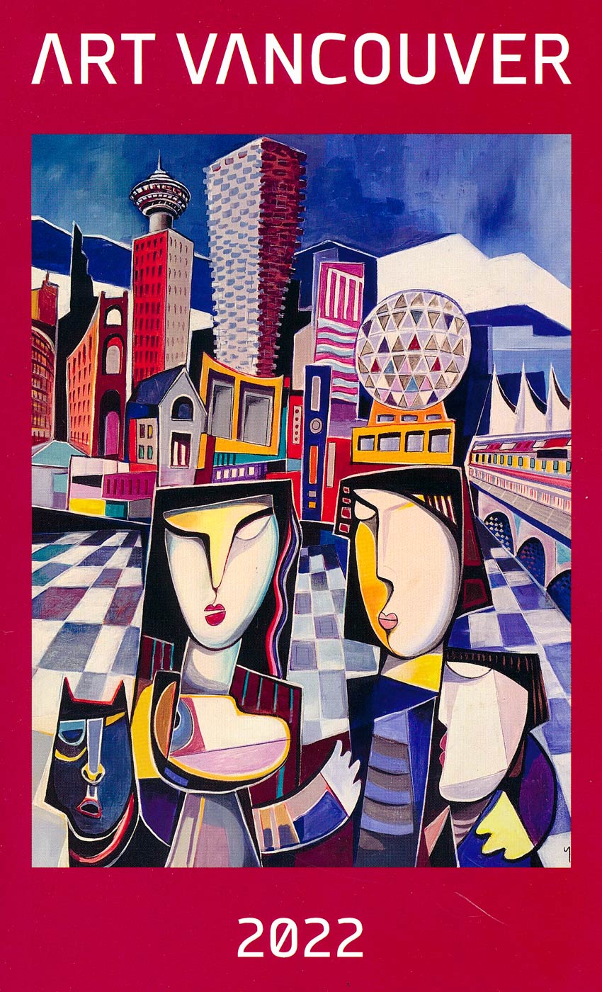
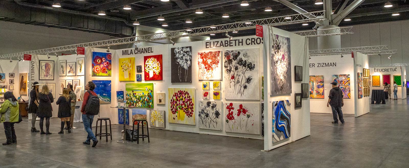
This past Saturday I took off by myself and went downtown to the Art Vancouver show at the Vancouver Convention Center. According to the show catalogue this is the sixth such event intended to raise awareness of Western Canada’s art scene. I had a wonderful afternoon wandering amongst displays of what I assume are the current arts styles being pursued by local artists and I ended it with a delightful lunch and craft beer at the Steamworks. My outing gave me much to think about.
I enjoy these events because I get a chance to see what others are doing, what they consider art, to meet the artists, to discuss their work and to contemplate my own efforts. I am a bit of a hermit and as a result have a very limited view of the art world. I am certainly not educated in the arts.
I admire these people who display their art works like this because, good or bad, they put their art out for people to experience and they open themselves to criticism and even scorn, not to mention the money it costs them to exhibit here. They have my admiration, each one of them. I am not so brave.
That said, most of what I saw at this show confused me. In my not too sophisticated opinion, “art” should reach out and stir something in you: it should evoke memories, prompt emotions, foster admiration for a wonderful talent. I felt most of the works on display failed in these tests. Many were not of high quality and much of the subject matter mystified me because I could not image
why anybody would see anything in it much less show it. There is no question about it: I must be a barbarian!
However, that said, I have learned over the years that criticism is destructive, unless it is tailored to teach. And even then it should only be approached by very knowledgeable people and with great delicacy. And art, in particular, being so subjective, criticism is often pointless, even irrelevant.
So I try not to criticize but to understand. And those things I cannot understand are simply that: things I don’t understand.
The Convention Center is a huge space with a contcrete floor and very high ceiling. The booths were of uniform white board and very little effort was made to create any kind of atmosphere in the displays to show off the art works to best advantage.
One of the tings I did not understand was the lack of basic marketing knowledge and technique. The booths were plain white walls and cement floor. There were few chairs or tables, not many brochures or business cards, nothing to make the booths stand out or props to soften the appearance of the art works so the viewer could imagine the work on their wall at home. Overall the appearance left me feeling cold.
As for the art works themselves, in most cases, I was not impressed. I just don’t understand modern abstract art. For me it is a substitute for artistic ability. I don’t see why anyone would want most of this stuff on their wall at home or decorating their offices. There were a few exceptions and rather than dwelling on the negative, lets talk about what I really liked.
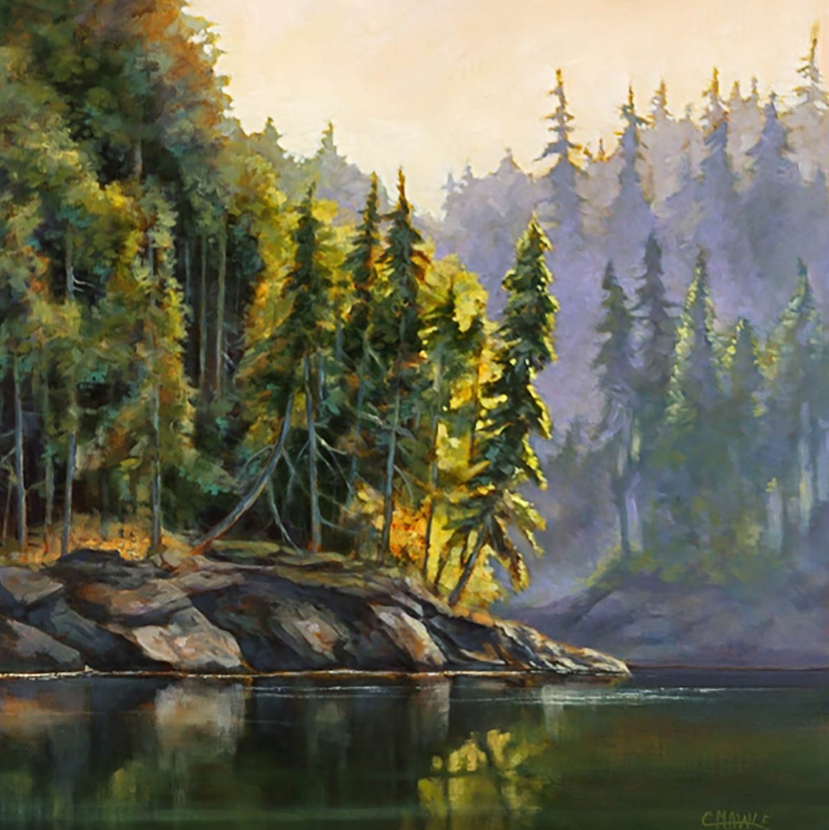
This work, called “Point of Reflection” I took from Cindy’s website. Here you can see her use of light and shadow to evoke a feeling of isolation and solitude. This image on my website is not large it does not adequately convey the depth and beauty of the original.
Cindy Mawle
I spent some time talking to Cindy Mawle about her paintings which really appealed to me. She paints scenes from the pacific north west coast and to my mind she captures the spirit of our northern waterways.
I was raised on the west coast. My father was a great fisherman and I remeber fishing with him in the 1940’s and 50’s in the local waters. For me, to walk on the gravel and rock of the coast, between forest and ocean, is to be at peace with the world. And Cindy’s work evokes that sense of calm within me. It is art that engages the viewer.
You can see examples of her work on her website which I highly commend to you. It is not hard to imagine one of her works on my wall at home, if there was any space.
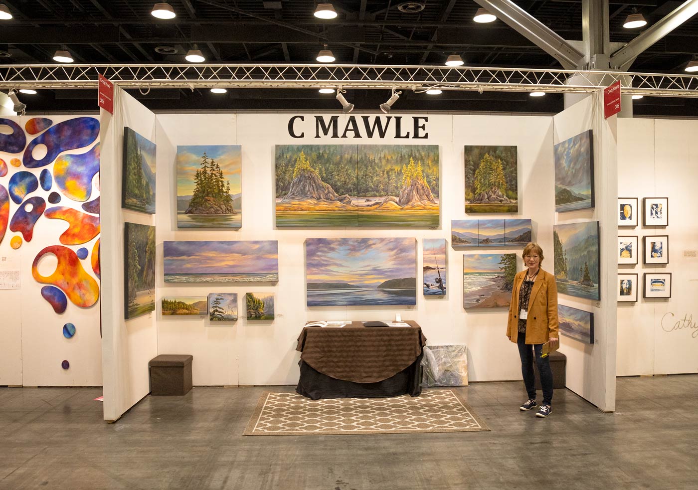
Cindy Mawle standing in front of her work at Art Vancouver. Notice that she took the time to add a small carpet and a table to her display. It provides perspective and helps the view imagine one of these canvases in their own home or office. And just look at the paintings! This lady manages to paint without small details but evokes the magic by her use of color, shapes, shadow and light. I really like her work and I admire her talent.
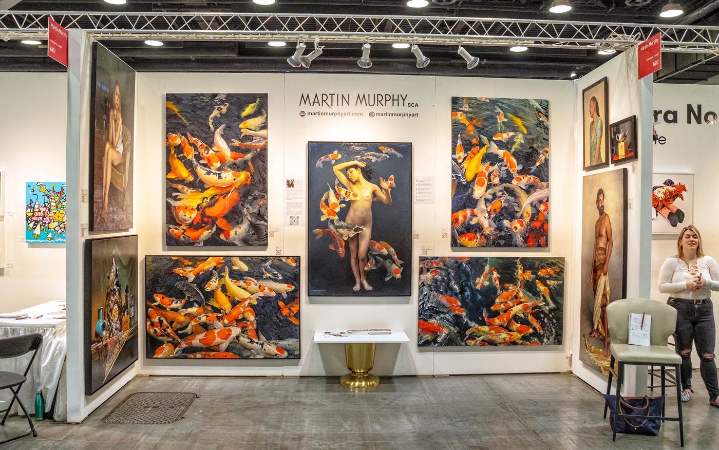
Martin Murphy’s exhibit caught my eye immediately with his four paintings of Koi fish, a subject which has totally escaped me. But he nailed it! And then I saw the rest of his works and each was better than the other. Really impressive!
Martin Murphy
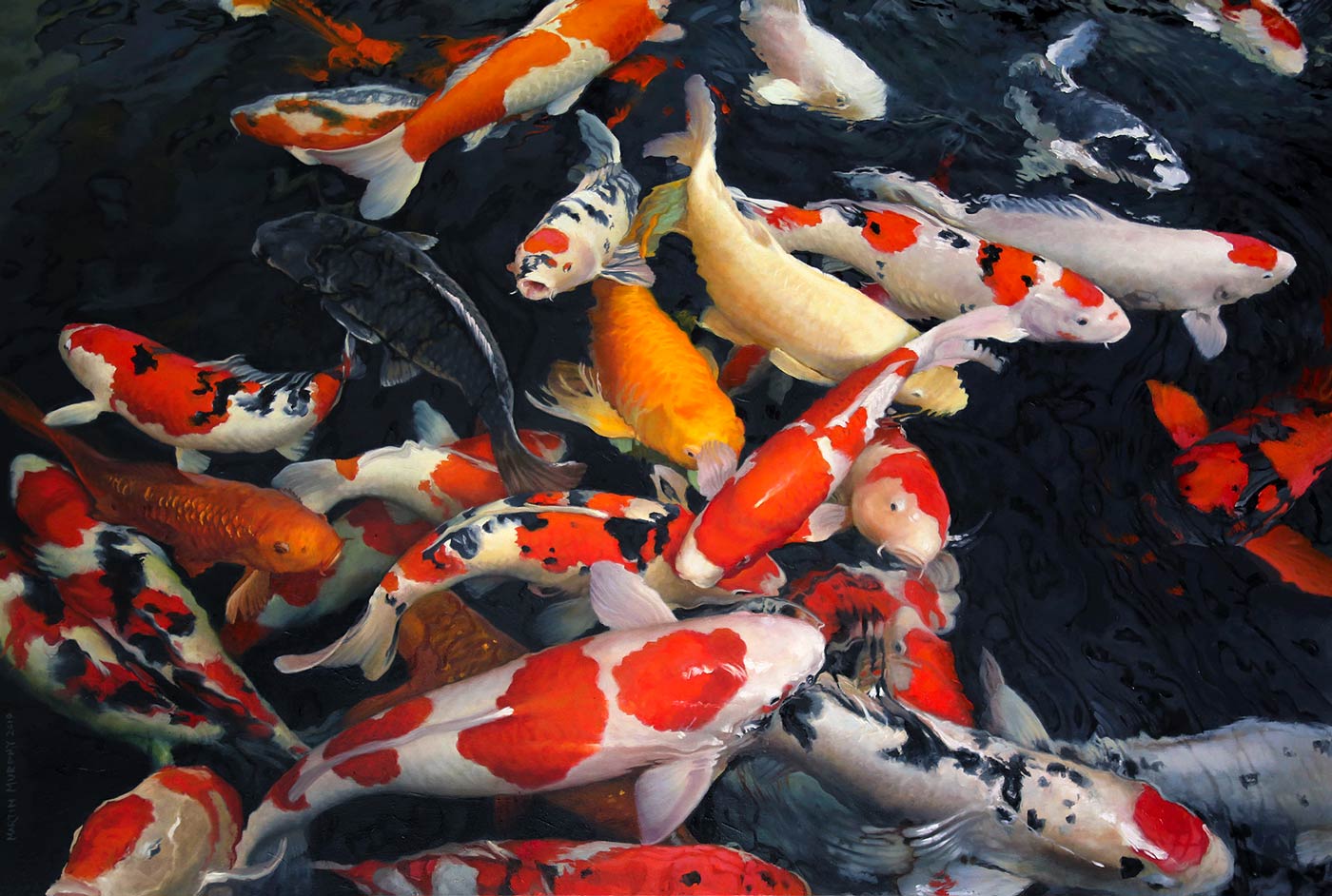
When I walked past Martin Murphy’s display I was immediately transfixed by four large pictures of Koi fish. I have tried for years to create photographic images of these fish and I have photographed them in Hawaii, Los Angles and here in Vancouver but so far I have failed. Martin has succeeded beautifully.
I love his realism. He paints pictures you can walk into. Where Cindy relies on color, shapes, light and dark, Martin relies on the details. The result is different but his pictures, too, draw you in.
Visiting his website is a neat experience. There is information about Martin’s background and examples of his work. Well worth a visit!
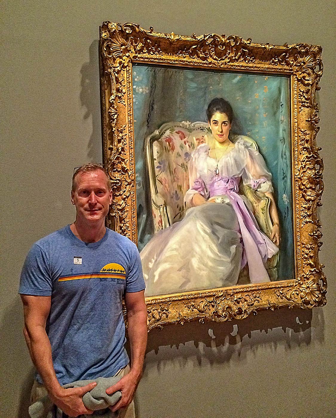
Martin standing by Sargent’s painting of Lady Agnew of Lochnaw. Appropriate because he paints very much in the same style. (This image is taken from his website.)
Mohammad Reza Atashzad
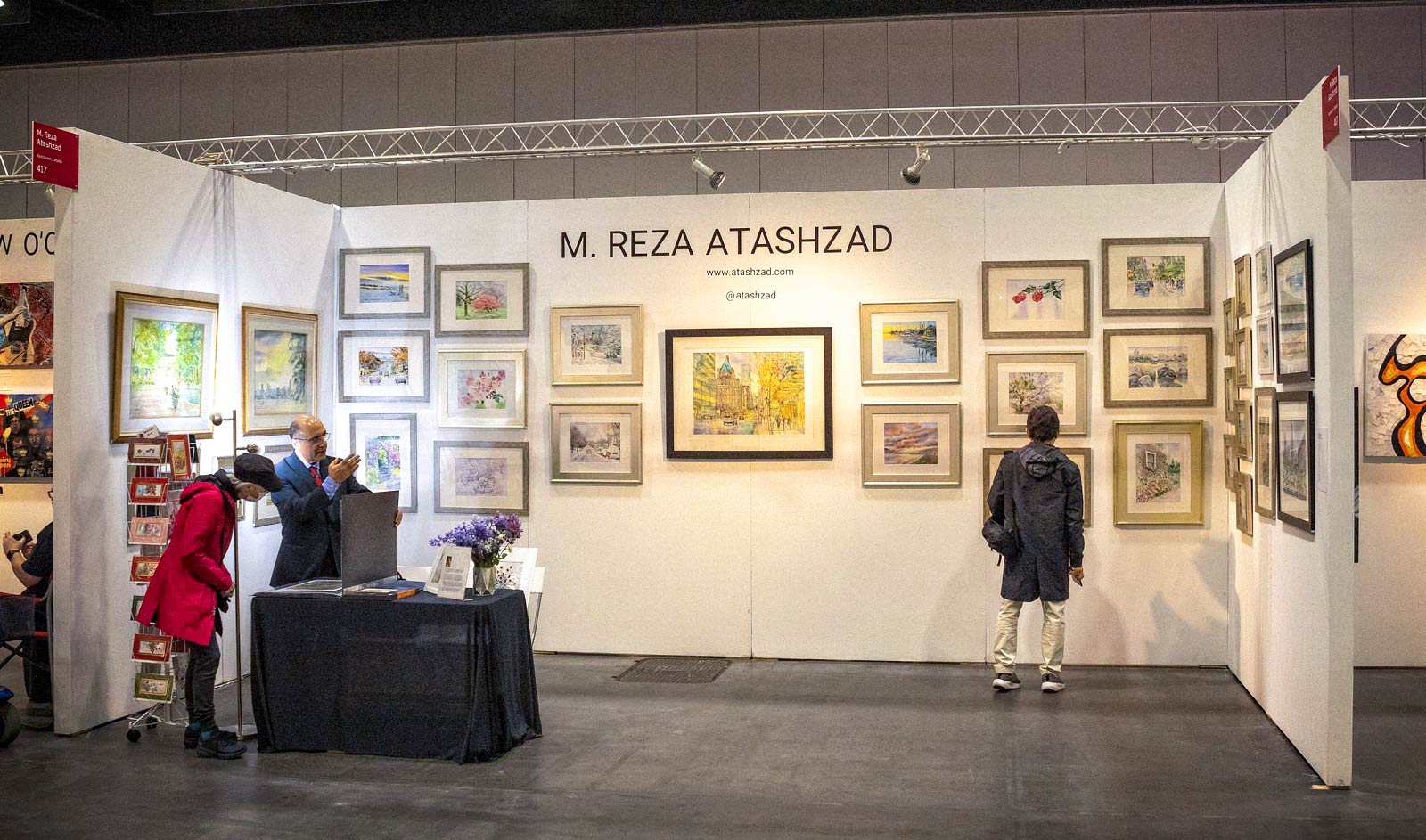
One last artist attracted my attention and he turned out to be really interesting. Reza’s style is totally different than Cindy or Martin’s but equally pleasing. I can’t explain why but I took no pictures of his work which I now regret. However, he has a wonderful website where he displays some of his paintings and drawings. The man is really talented.
The show catalogue says Reza is a Vancouver artist but his website says he is from Tehran in Iran and mush of his art is of scenes from Iran. So he is a man who has travelled widely.
If you look at these three painters you see three very different but equally valid styles. That is the wonderful thing about painting: each artist can create their own style of representing their subjects but still draw you into their work. With photography that is a little more difficult because we are constrained by the limitations of our equipment and the reality of what is in front of us. Painters only deal with the reality in their heads. I envy that.
Pablo Galiacho
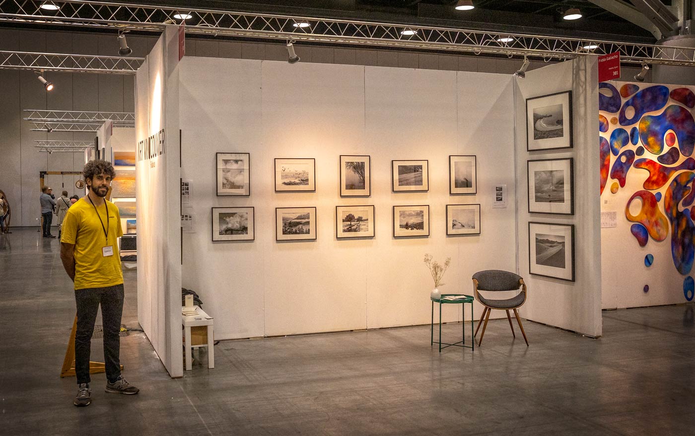
Finally, there was a lone photographer in the show. Pablo Galiacho has had me thinking for the few days since the exhibition. His work appeals to me in that he photographs many of the same things that I like to turn my lens to. But there was so much in his technique that covered his potential. And it was not my place to start critiquing his work at the show. He must find his way to his own style. However, I want to make a few comments here about photography generally.
Pablo Galiacho standing by his exhibit space. His images are of many of the things that I like to photograph and so I was able to relate to his work.
“Niebla” by Pablo Galiacho. I took this image from the Art Vancouver Program and it does not do justice to this print. Had I been there, this is an image I would have taken. It is a wonderful composition. But, I would have processed it differently. Fog is light , it is nebulous, it adds mystery to a scene. This image needs brightness, a lack of sharpness in the structures (but not in the tree) and contrast.
The roots of photography lie in techniques that made large prints problematic. Not only was the equipment primitive but the darkroom requirements for large prints were not available to most people. And so art photography was based on the small print. Even today, most of us are limited to printers that will give us a 13 x 19 inch picture. But to me, if photography wants to be art it has to produce prints that will dominate a room. It has to go head to head with the painter’s large canvases.
For me, Pablo’s prints are photography from the 1950’s. However attractive, the subjects are encased in small framed prints that will be relegated to small walls where they will never be seen.
Look at Martin Murphy’s exhibit. The prints jump off the wall. They fill your senses with contrast and color. I find Pablo’s prints to be lacking in contrast. If he is making silver halide prints in a darkroom he has to use a more contrasty paper/developer combination. If he is developing digitally he needs to work on the Curves and Contrast sliders.
Both of these comments have to do with technique. These are issues easily corrected. In my mind Pablo has an eye for a good subject. But no matter how good his photography is, with bad technique it will never be appreciated the way it should be.
He had many examples of his work on his website which has unfortuately disappeared. It is worth a visit. But when looking at his images, try to imagine them larger and with greater contrast. He is a good photographer. Look at “Nieblo” on the left here. That is a neat image. It just needs to be 24 x 36 inches.
Final thoughts …..
We have discussed three totally different artists and one photographer and their styles. None of them is better than the other but I am sure that everyone will have a preference. That is a wonderful thing about art. The artist prepares the work but the impression it has on a viewer depends on what the viewer brings to it. It is a two sided transaction. The same work may be art to one and be meaningless to another. That is why art is such a personal thing. And that is why I am loath to be critical of any one’s art.
I enjoy these shows, and art galleries, and outdoor art markets, because I get challenged to be a better photographer. What a painter does may be the inspiration for a photographic treatment of an image. You never know where the inspiration will come from so you have to be open for it all of the time.
I have singled out four artists to comment on. The rest of the show was confusing to me. I thought most of what I saw was not worthy of being exhibited and yet someone was willing to pay a substantial sum for the chance to put it out there. So what am I missing? I don’t assume to be an authority and so I must think I am missing some part of my education. Either that or, truly, the Emperor has no clothes.
This website is the work of R. Flynn Marr who is solely responsible for its contents which are subject to his claim of copyright. User Manuals, Brochures and Advertising Materials of Canon and other manufacturers available on this site are subject to the copyright claims and are the property of Canon and other manufacturers and they are offered here for personal use only.

The True North Strong and Free


