The Canon Logos and Trade Marks
“A rose by any other name would smell as sweet”

This image of the Goddess Kwanon is cited as the first Seiki-Kogaku (Canon) logo but it is hard to find legitimate examples of it ever being used.
Huge companies are known by the smallest of symbols. We all know what company uses the apple with a
bite out of it. The picture says it all. Some use their
name. The multi coloured Google name is
identifiable instantly because of the attention
paid to the design of the word “Google”. The
same is true of Canon. The distinctive style of
the text used for the name sets the company
apart and makes it instantly recognisable from
across the camera shop.
The story behind the logo Canon uses is not well
told on the internet. If you search you will find
that everyone is quoting everyone else and the
actual detail is scanty. However, what follows is
what I have gleaned so far.
Over the years, from its earliest days, Canon has
used many logos and trademarks, often in a
seeming haphazard fashion. The familiar red
“Canon” that we are so familiar with today did
not just happen by accident. It was the
culmination of a long series of ideas and designs.
The dividing line between the use of this logo or that is totally blurred and the dates are largely fluid and of little value attempting to identify products. However, it is useful for the collector to have these devices catalogued and dated as far as is possible. We shall do this in approximately chronological order with as much as we can divine about the dates of their use. The labels for the different devices are our own creation for clarity in discussing them subsequently.
The Kwanon Goddess Logo
In the beginning the Precision Optical Instruments Laboratory, Canon eventually, while working on the prototypes for the cameras to come intended to call their camera the “Kwanon” after the Buddhist Goddess of Mercy as we well know. The first logo to be designed, probably in 1933 or 34, was the “Kwanon Goddess” which showed the Buddist deity with the word “Camera” above it and “Kwanon” below.
The Kwanon X is the only known camera to have this logo applied to it and the authorship of that camera is suspect. No other cameras have come to light bearing this logo and there appear to be no advertisements that use it either.

Kwanon Script A

Kwanon Script B
Advertisement displaying the Seiki Eagle Type A from Asahi Camera of December 1939. (Hayato, 92)
Canon Eagle Type A
When Canon changed its name from Seiki Kogaku in August, 1947, to Canon Camera Company, Ltd. they were still using the Seiki Eagle. After the name change they continued to use the Eagle but replace the word “Seiki” with the new name “Canon”. Otherwise the logo remained the same although its use was beginning to be phased out and was gone completely by 1956.
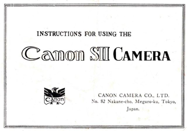
The cover of the Model SII illustrates the use of the Canon Eagle Type A. It is the Seiki Eagle Type A with the word “Canon” replacing the word “Seiki”.
Canon Eagle Type B
Just as with the Seiki Eagle, the Canon Eagle Type B was the Type A without the feet. Like the other Eagles this one was used in ads and printed manuals and catalogues. Well, was not used on cameras with one single exception.
The last use of the Canon Eagle B anywhere was on the Model P camera issued in 1958 as a 25th year commemorative camera which was made available to Canon employees. Not being issued generally to the public it is quite rare today in the collector market and commands a premium price.
Because of the value of these cameras they have attracted counterfeiters who have produced Model P’s with what purports to be a Canon Eagle Type B. These can usually be detected by the inferior quality of the engraving.
The engraving on an original Model P 25th anniversary commemorative is crisp and clean. The two images below from the same camera, show an authentic Canon engraved Eagle.
The engraved lines are clear and precise. Note the line separating the beak of the bird from the head and how it connects cleanly on both ends. There is a definite indent on the bridge of the nose and the eye has a clear and distinct pupil. And finally, the word Canon has evenly spaced letters.
Kwanon Script A
The Canon corporate website shows a script word “Kwanon” and says of it that “The engraved Kwanon logo was used on cameras trial manufactured by the company….” But this does not appear to be supported by the available evidence. No cameras appear to exist with this script logo and I have found no printed material that uses it either.
Kwanon Script B
The Script A appears to be missing in action however on the images we have of the Kwanon B and Kwanon C there appears to be a totally different script logo. Again this is a dead end as no further cameras appear to exist with it and it appears that it was never used in advertisements we have seen.
Seiki Eagle Type A
Seiki Kogaku began using a styalized Eagle as a logo as early as 1937. Obviously it was intended that this become a recognized symbol for Canon camera and it appeared in many advertisements and on several accessories. It does not, however, appear to have been used on any camera .
The Seiki Eagle appears to have been in use from 1937 until the change of name from Seiki Kogaku to Canon Camera Company Ltd. in September of 1947.
Seiki Eagle Type B
The Type B Seiki Eagle is simply the A Type without its feet. This is not seen in advertisements but can be found on some accessories and leather cases.
The wings will sometimes have a single line creating two feathers and other times it will be a double line which gives three feathers. In the image below the Eagle on the Sport Finder has the double lines while the other, from a different accessory, has a single line.
The dates for the Seiki Eagle Type B are the same as for the Type A.
This is an image of the bodies of two early Seiki Sport Finders taken from Hayato’s book, pg. 98, showing the use of the Seiki Eagle Type A and Type B.
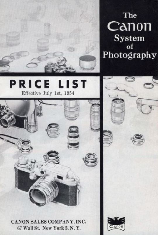
This 1954 Canon Price List shows a use of the Canon Eagle Type B.

This is a Canon Eagle B on a Model P 25th anniversary camera which was made available Canon to employees. This is the last use we know of for the Canon Eagle.

This is a closeup of the Eagle B shown on the left. Note the quality of the engraving and the head details.
The image on the left is widely considered to be a forgery. There are several reasons for this opinion.
The shape of the head is wrong and there is no indent over the bridge of the nose. The line that separates the beak from the head is completely missing.
The spacing of the letters in “Canon” is uneven. Look at the space between the “C” and the “a”.
The eye is slanted and does not fit within the head well.
Finally, the engraving is weak and uneven. Compare it closely witht e engraving on the Eagle in the two above images.
Canon Script A
By the time Seiki Kogaku was ready to bring their first camera to market they had decided that they were not going to use the Kwanon name. So in June of 1935 Seiki Kogaku filed a trade mark application for the Word “Canon” which was granted in September of that year.
In the new products section of the October 1935 issue of Asahi Camera the Hansa Canon camera was announced. (Hayato, 42). That earliest Hansa Camera displayed the Canon Script A. Seiki Kogaku had this script professionally designed and it was adopted in 1935 in time to be used on the Hansan Canon. It continued in use on cameras until 1956 when it was last seen on the Model L2.
The brand name “Hansa” did not last long. Hayato tells us on Page 46 that an advertisement appeared in Asahi Camera magazine in September 1937 showing a camera branded as “Canon” only and from that time the Hansa name is gone and cameras are branded as Canon in the Canon Script Type A..
Canon Script A2
There is a subtle change to the Script A beginning with the Model L1 in1957. On the original Script on the Hansa Canon the serif on the upper case “C” is small to the point it is not noticable. On subsequent cameras the serif is a bit longer but still not noteable.
However, starting with the Model L1 the serif on the top of the letter C is elongated pointing into the center of the C and the characters in the rest of the name are thicker in outline. The shape of the letters are more angular. The script is similar to the Type A but different enough and important enough to have its own name.
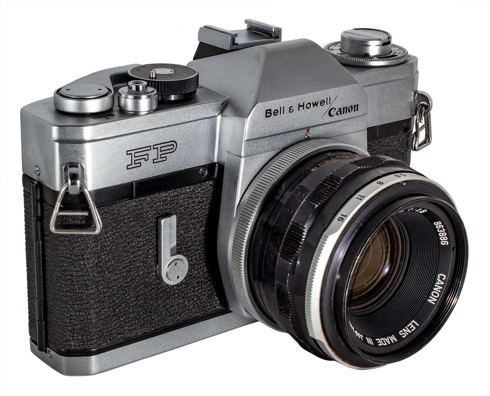
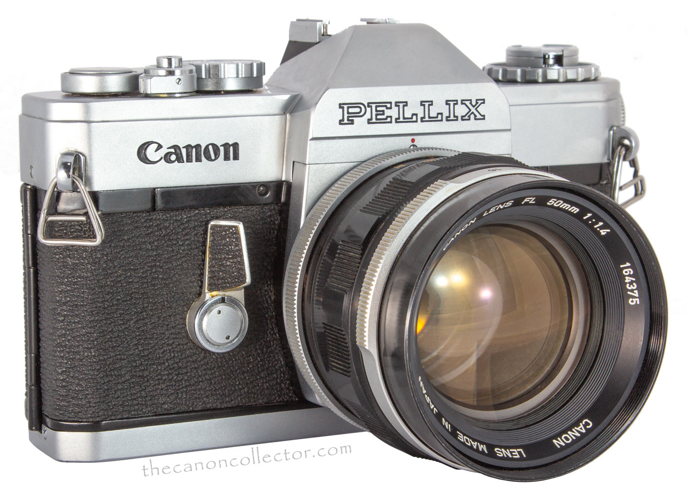
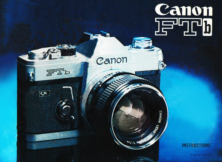
You will find this Script on the cameras from L1 to the 7s, on the Canonex, the cameras of the “F” series (except for the Pellix and Bell & Howell FP), and the “A” Series cameras, and on some Canonets. By the time the T50 appeared in March of 1983 the A2 Script was largely gone.
Canon Script B
The Canon corporate website tells us that a new Canon script was settled upon in 1953. It is much more like todays logo script in that the letters vary in thickness instead of the uniform thickness of the Type A scripts. The serif on the “C” is sharpened and more pronounced and the letters are more rounded. However, the most notable difference is the letter O. The edges are much thicker and the white center is oriented vertically.
Origins of this script can be seen even before the War. As early as 1937 we see this script, or something very close to it, used on an advertisement for the Canon Model S in the Asahi Camera magazine of September 1937. There are small differences but it is obvious that the Script B was already in the minds of the designers at Seiki Kogaku.
The Script B, or something very close to it, appears in Seiki Kogagku advertising in Asahi Magazine in September of 1937.
The first production camera from Seiki Kogaku was the Hansa Canon which used the Canon Script Type A in the name.

The Canon Script A was used on all rangefinder cameras until the Model L1.

The Script A2 as it appears on the front of an “F” Series camera.
The Script A2 as it appears on the front of an AE-1

Canon Script B as it appeared on the cover of the User Instructions for the Model IIIA from before 1953.
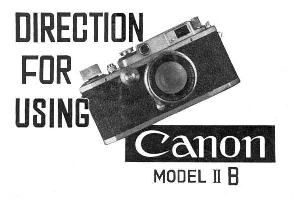
Canon Script B as it appeared on the cover of the User Instructions for the Model IIB from before 1949 up to 1952.
Surprisingly this Script does not appear to have been used on any cameras. However it appears in advertisements from 1937 through to the User Manual for the IID in 1952. Then its use seems to die out in favor of the Script C.
Canonflex Script
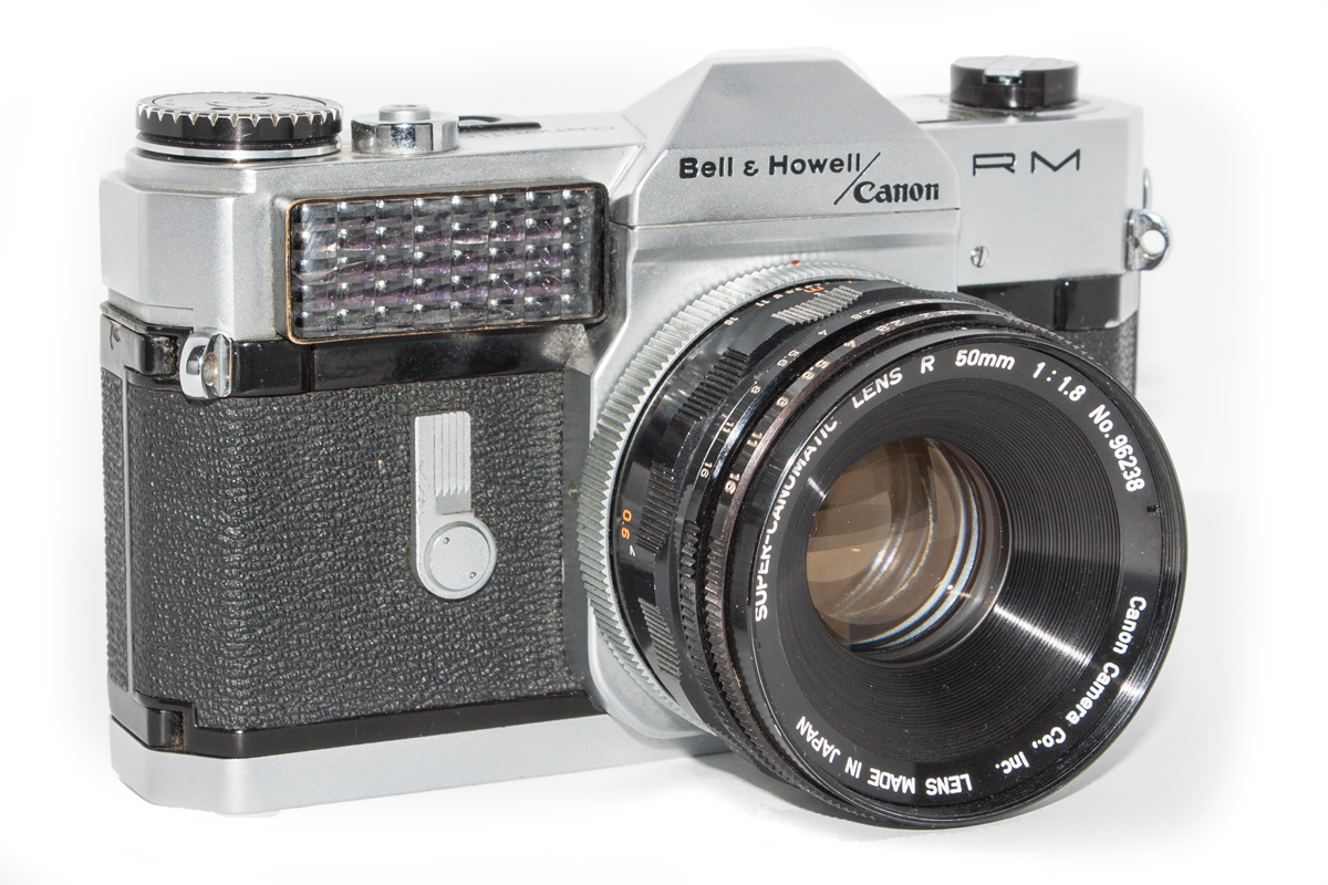
The Canonflex cameras stand out as having used a sans serif script on the front of the prism housing to brand the cameras. This unique script is seen on all four Canonflex cameras and it can be found on the front of the Mirror Box 2. But it was short lived having originated on the Mirror Box 2 around 1957 and ended with the Canonflex RM in 1962.
Surprisingly, on the top deck by the shutter button the camera name appears in the Canon Script Type A2. Also it is to be noted that on Bell & Howell branded cameras the Script C is used.
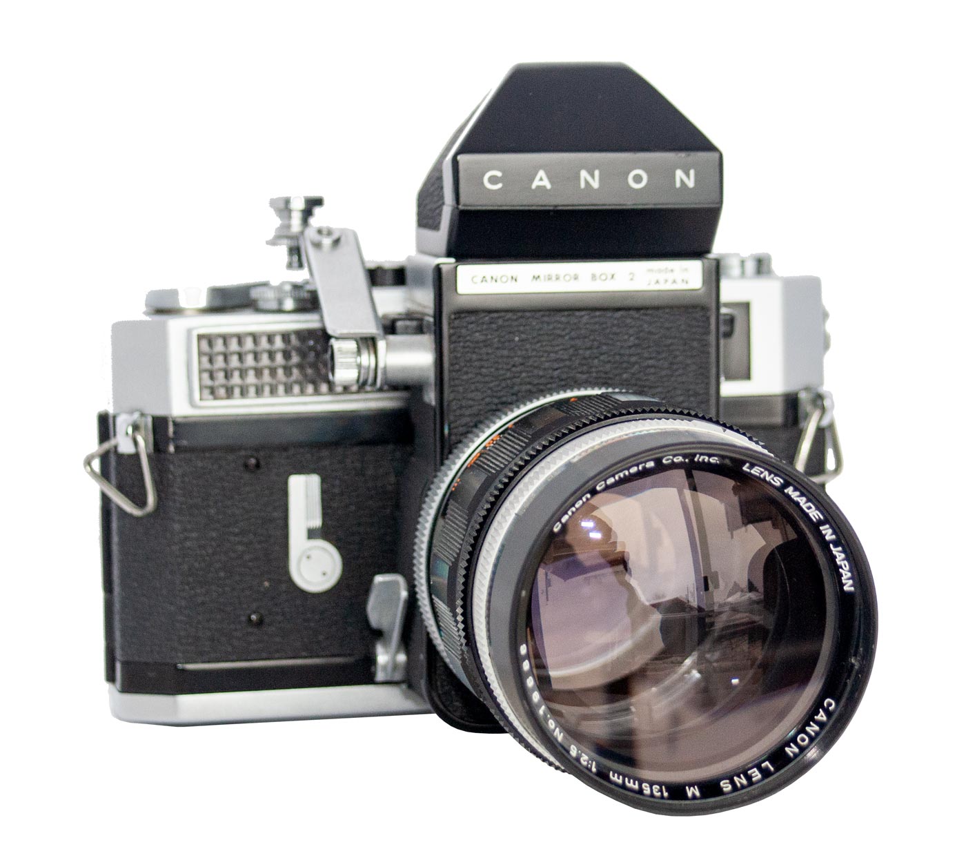
The Mirror Box 2, here shown on a Canon Model 7, uses the Canonflex Script on the front of the prism housing.

The Canonflex Script on the front of the Canonflex Camera. All the Canonflex cameras, except theBell and Howell branded ones, use this script in the branding of the camera.

On the top deck of the Canonflex cameras the name of the camera model is written in the Canon Script A2 although the Canon brand is written in the Canonflex Script.
Canon Script C

The Canon Script C as it is used today. Canon has finally settled down and adopted this one word as their trade mark and it has become known universally across the world.
And at last we come to the modern script and logo of Canon that appears on all modern Canon cameras and literature. The Canon corporate site says it was adopted in 1956 but it was not used exclusively for a long time.
This script is a refinement of the Script B and their similarity is obvious. The major distinguishing feature is the center of the “o” which is set at an angle. This makes them easy to tell apart.
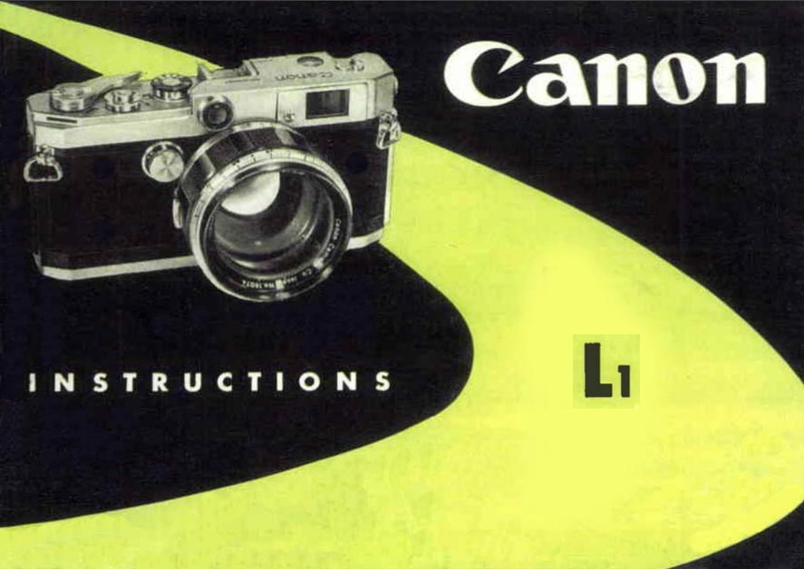
One of the earliest uses was on the Instruction Manual for the L1 which we can date to 1957. From that point we find increasingly frequent use of the Script C on Manuals and brochures. It appeared on the front of the Canonet Jr. in April of 1963 and many but not all subsequent Canonet models . It then skips the “F” Series of cameras, except for the Pellix and the Bell&Howell/Canon cameras. It appears on none of the “A” Series cameras but then with the T50 it is used on all subsequent Canon cameras to the present day.
The Script C may not have appeared on Canon bodies consistently through the “F” and “A” Series but it was used on their Instruction Manuals consistently from the Canonflex series onward.
It took Canon a long time to make their branding of their cameras uniform across camera models, printed materials and advertisements. As Seiki Kogaku they made Canon Cameras and Serenar Lenses. This is too many
The Script C was adopted widely on Instruction Manuals, Brochures and advertising before it was used to brand cameras.
unrelated names for good marketing. And you can see that their branding was inconsistent if not chaotic until the early 1980’s. It was with the “T” Series that branding settled down to the Script C word “Canon” which has since become recognized around the world as the Trade Mark of the Canon companies.

Canon took a long time to settle into a uniform branding of their products. We have looked at the major logos and scripts that have been used. There are some minor ones you will run across. For instance, the Canonet cameras use different scripts which we have not discussed here. Such uses were extremely limited and are not significant to our discussion.
Since the 1980’s the Script C has been used exclusively on Canon’s cameras. But prior to that time one could describe the situation as chaotic. For the collector these scripts and logos are not much help in dating cameras and accessories. It is a good practice not to rely on them as you can see. This whole article may not be of much use but it is part of the Canon story.
This website is the work of R. Flynn Marr who is solely responsible for its contents which are subject to his claim of copyright. User Manuals, Brochures and Advertising Materials of Canon and other manufacturers available on this site are subject to the copyright claims and are the property of Canon and other manufacturers and they are offered here for personal use only.

The True North Strong and Free


